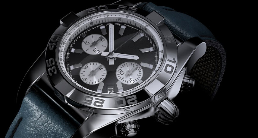
Have you noticed that clocks in advertisements are usually set to 10 in 10? This is not a random choice. The time 10 in 10 looks like a smile. It welcomes you and hopefully makes you experience the watch displayed in a positive way.
The time 10:10 makes the face of the clock look balanced and pleasant, which is considered gentle on your eyes. This method has been used for as long as possible because it works well. The layout means that the watchmaker’s logo, usually at the top of the dial, is clear and easy to see.
When advertisers set their clocks to 10:10 for photography for advertising, they are following a long tradition. This highlights the watch’s design and can subtly make you experience comfort and joy.
The 10 in 10 clock creates a balanced and attractive look that makes you want to keep looking at the picture. Designers love to use symmetry because it makes things look neat and orderly which is pleasing to our eyes. In addition, it is the case that the time 10 to 10 means that the hands are not on top of each other. It is also important for the impression you get of the watch on display.
By choosing to show clocks at 10:10, advertisers speak to our love of balance and positive imagery. They don’t just try to make the watch look good, they strive to make us experience that we like how we feel when we look at the watch.
Now let’s look at the story behind the 10 in 10 clock ads to understand it all a little better…
Before we had digital technology, 10 o’clock was the norm for images of clocks in advertisements. There is actually a historical connection to this. Some say that 10 in 10 is the time when President Abraham Lincoln was officially declared dead after he was shot. Others believe that it has always been about aesthetics.
Regardless of the real reason for 10 in 10 in pictures, the tradition lives on. It’s a way for today’s watchmakers to pay respect to the past and also proof that the basics of smart marketing never go out of style.
The time 10 in 10 makes the hands of the clock look like a V pointing upwards, which leads your eye to wander directly to the brand logo at the top. It’s a smart way to make sure you remember the brand because our brains like this kind of balanced design that shows us the way.
Think of it this way: you don’t just see what time it is, you also get a sense of the brand’s personality. Keeping the logo clearly visible is important. It is one of the most important things that the ad should show you.
If you only remember the brand of the watch, chances are good that you will actually buy it in the end. You will ask for the name when you enter a watch store. This is a small thing that can have big consequences. In the fiercely competitive world of advertising, every little thing counts. The choice of 10:10 shows the careful planning required to keep a brand in your mind!
Genom att använda våra tjänster godkänner du vår användning av cookies. (Läs mer)
Johannebergsgatan 3, 41255, Göteborg | [email protected] | 031-16 67 70
2024 © Braklocka.se